The Audit Office of New South Wales—Brand audit and report, brand identity and visual systems refresh
Using a comprehensive brand audit to support and drive the brand refresh for an important government institution.
Project overview
SERVICES
ENGAGED
Communications
- Internal
- Presentations
- Visual
Content
- Photographic
- Strategy
Creative/ strategy
- Analysis
- Auditing
- Research
- Strategy
- Surveys
Design
- Brand
- Corporate
- Information
- Publication
Project management
- Estimating
- Planning
- Implementation
- Reporting
PROJECT
MODULES
Discovery of current brand
Analysis and measurement
Evaluation and recommendations
Implementation of brand refresh
OUTPUT AND
DELIVERABLES
-
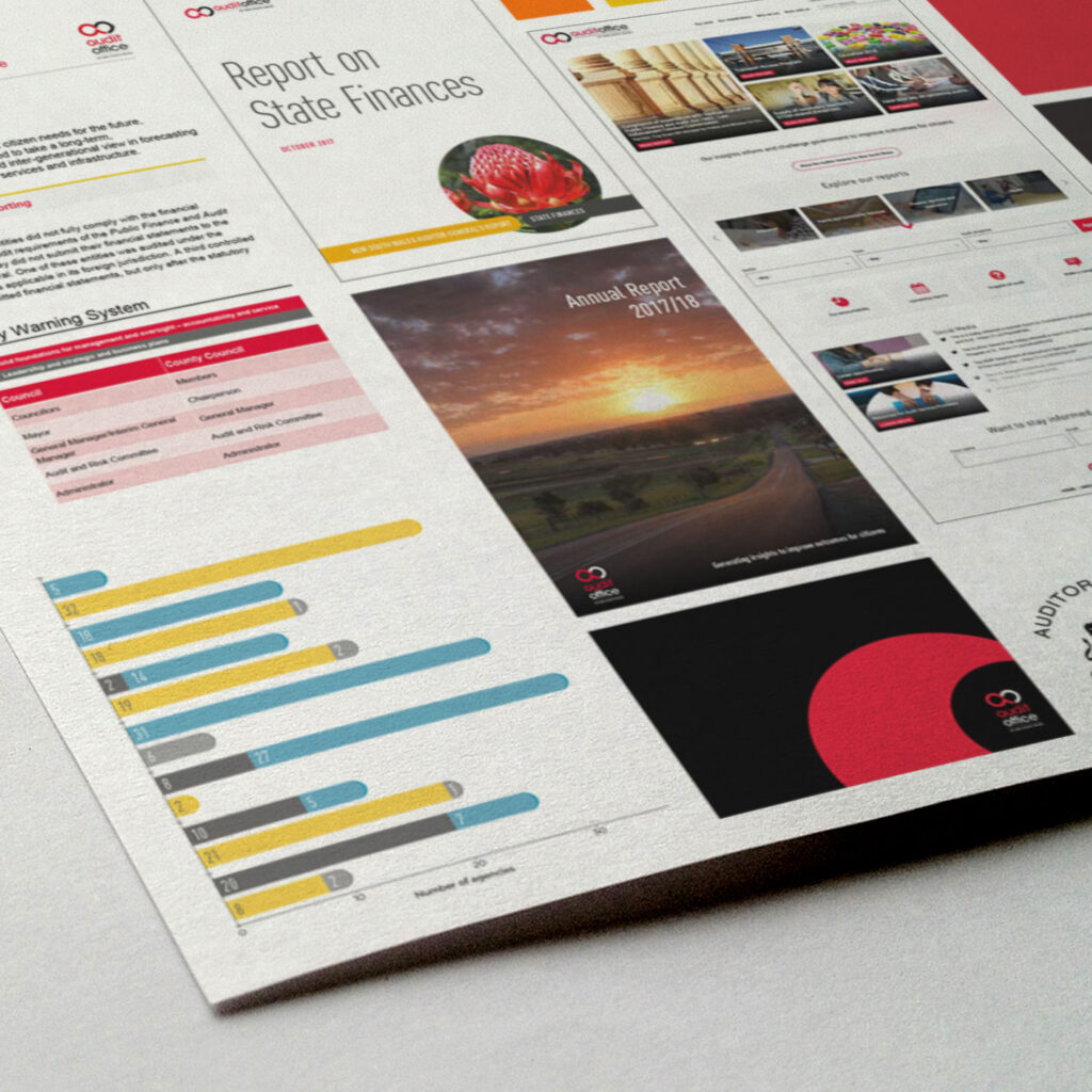
Brand reportDetailed analysis of the Audit Office existing brand, including compilation of all current visual language, comparison with competitors, brand survey of internal stakeholders, evaluation of brand elements, and recommendations.
-
BrandmarkLogo files output in various colour and file formats.
-
Colour paletteA refreshed set of colours for use throughout the Audit Office brand.
-
Brand guidelinesPDF document providing staff guidance for logo usage, typography, colour, imagery and collateral uses.
-
Communications templatesTemplates for Word documents, PowerPoint presentations and InDesign cover layouts to assist Audit Office staff in the use of their new brand.
The client
ABOUT
Established under the Public Finance and Audit Act 1983, the Audit Office of New South Wales is the financial review arm of the NSW Government.
The Audit Office conducts audits for the Auditor-General, helping parliament hold the government accountable for its use of public resources.
The financial and performance audits of the Audit Office provide an independent opinion on NSW government entities’, universities’ and councils’ financial statements. They identify whether the statements comply with accounting standards and relevant laws, regulations and government directions.
Over several projects we have worked closely with colleagues of varying seniority across the business, including the Auditor-General herself.
Background
The Audit Office approached us to audit and review their brand and visual identity to determine if an update was necessary.
The Audit Office sought to understand their brand positioning internally and externally. Internally, they wanted to know how staff and key stakeholders thought of and engaged with the brand. Externally, they wanted to understand how the Audit Office ranked against other organisations within their financial sector. How attractive were they to new talent? Did their branding represent them in their best light?
The brief also required us to assess visual elements impacting accessibility, and improve upon them where possible.
Challenges
From the outset, this project had no clear path, rather a process that involved extensive discovery to investigate and determine the best course of action for the Audit Office and its brand.
A visual and brand audit in this instance was more challenging as the Audit Office does not compete in an open market (except for graduates).
For the Audit Office, the priority of most communications is to convey information. They do not have to attract clients or create advocates. The main audience of the brand is the Parliament and the employees of the Audit Office themselves. Therefore, information had to be gathered
The Audit Office is a sizeable organisation with many departments, each individually producing their own communications. Because of this, there was a vast amount of material which had to be collected and documented to gain a thorough understanding of the brand.
Solution
Beginning the process of discovering the brand
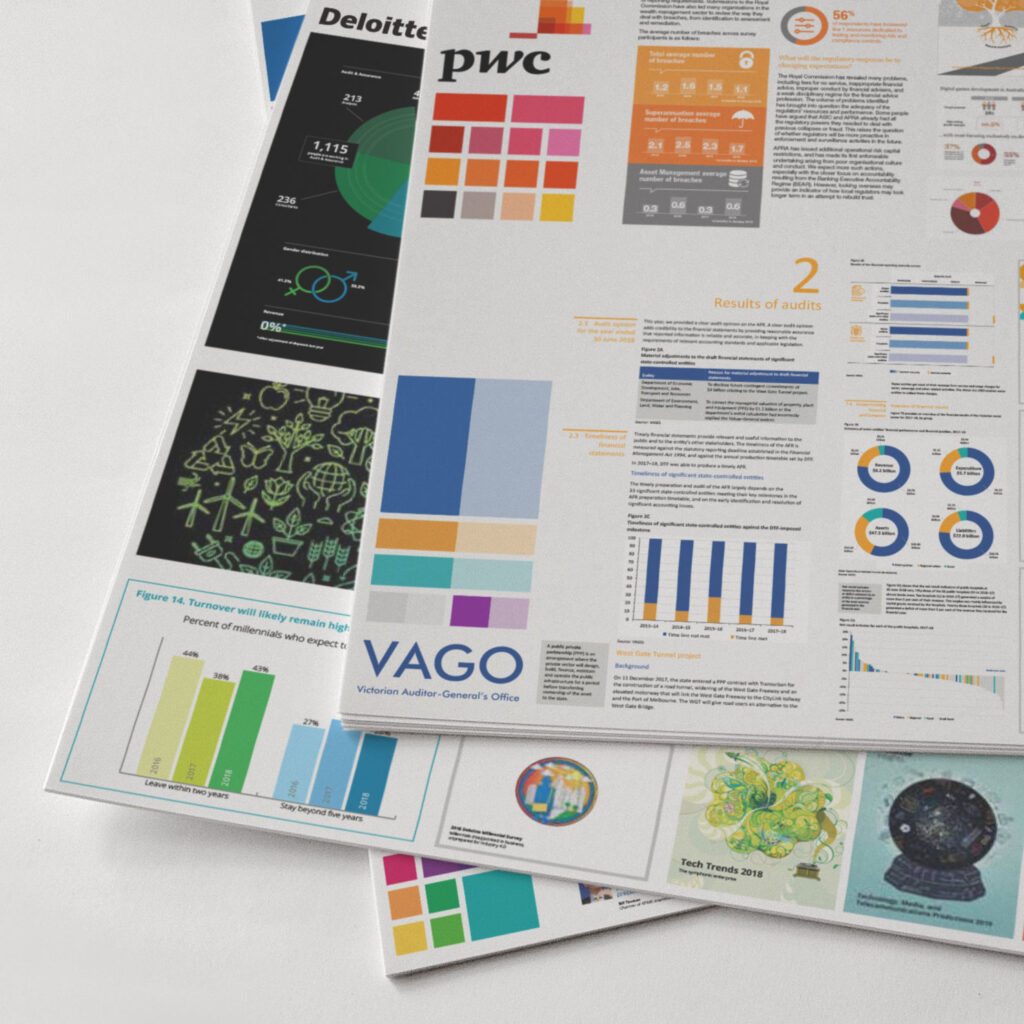
We began by looking at other state’s Audit Offices around the country, and abroad. We also reviewed similar commercial organisations, and conducted an analysis of what each entity presented visually, both internally and externally.
This included standard visual identity elements such as the colour palette, logo and usage guidelines, fonts and brand imagery. How graphs, charts and tables were crafted, and how those elements were combined to work successfully in the formation of a brand image.
This provided us a detailed understanding of where the Audit Office currently sat amidst its peers, while simultaneously setting the benchmark through which we could quantify.
Next, a full review of all Audit Office visual assets was executed. A collaborative effort, facilitated by lcdc.co with additional support provided by Audit Office colleagues, ensuring the audit team received maximum saturation of the current brand image. Additionally, we looked at the visual history of the brand through nearly 20 consecutive years of Annual Reports. This showed us how the brand had evolved over time, and what if any, influences had shaped or driven it.
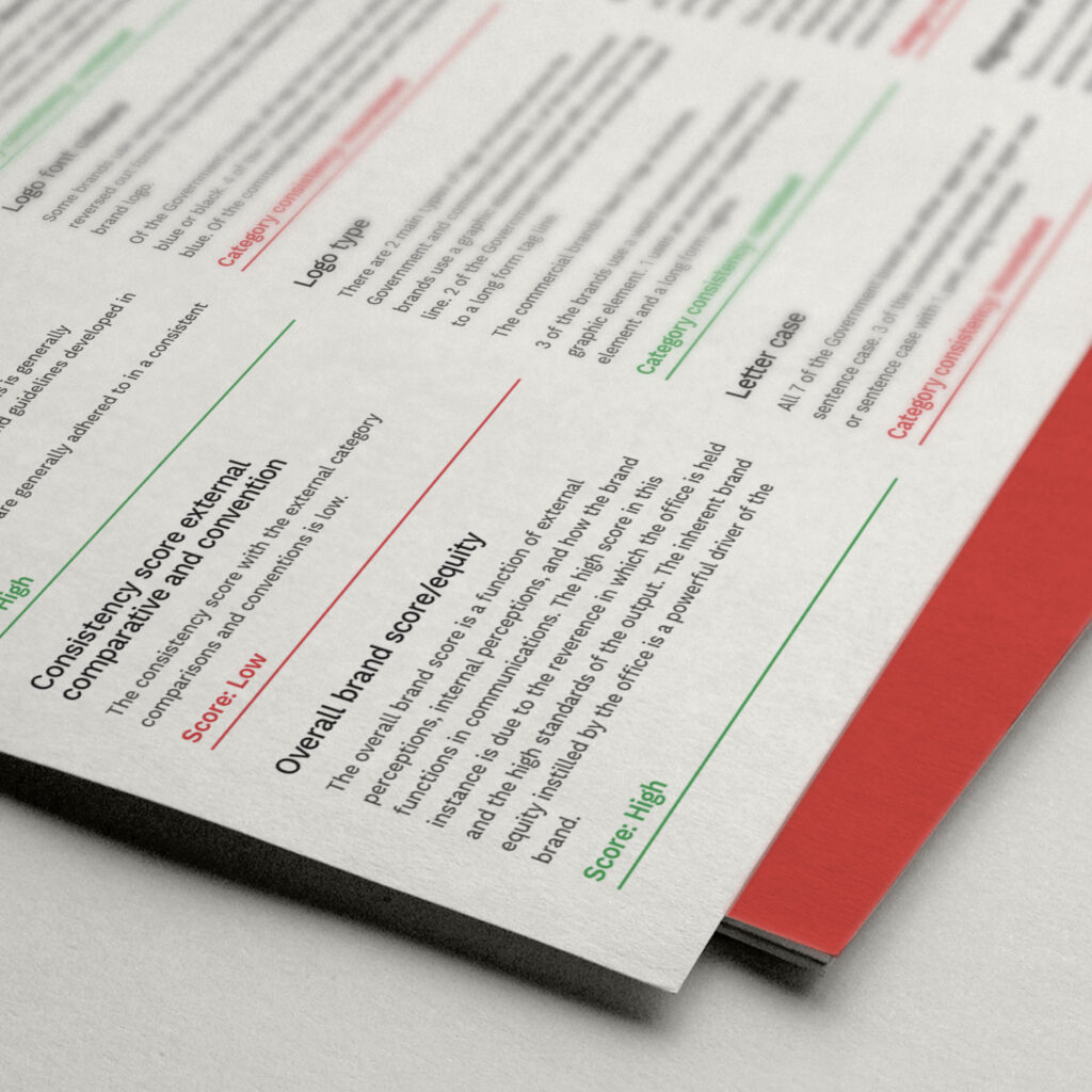
Each element submitted for inclusion in the audit was checked against brand guidelines determining to what level it complied with correct corporate colours, what images were in play, as well as iconography and positioning of brand elements. The completion of this task allowed us to measure consistency.
Discovery
Collection of visual brand assets for review
Identify stakeholders (internal and external)
Create brand evolution timeline
Create category comparison
Create assets map of brand visuals
Annual Reports (2001 - 2018):

lcdc.co’s review of this asset series revealed the visual identity to have been ever-evolving, over a 20 year duration. In addition, the review verified design styles and elements were organically adopted into the visual identity, at periods of two to three years. This was due to the lack of relevant and stringent guidelines in the visual system. Over time without rules to follow, the brand’s integrity became diluted, evident in reports from the latter years. The reports from 2016–18 are barely identifiable as pieces of communication broadcast by the Audit Office.
Discovery
Create survey to send to internal stakeholders
Utilise the assets map and category comparisons to conduct a round table with key decision makers
Generate survey results scorecard to measure brand and visual asset effectiveness
Create survey to send to external stakeholders
Surveying the Audit Office
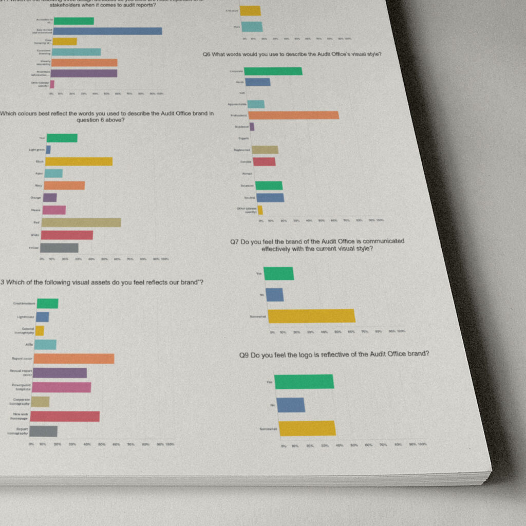
Then, we surveyed colleagues on how they utilised the brand’s visual identity, asking if in their opinion a brand update was necessary, and to what level such a change might be welcomed.
A survey was completed by 32 respondents over the course of December 2018 and January 2019. 16 questions were asked in relation to the visual assets and brand which yielded both qualitative and quantitative data.
Example questions
What words would you use to describe the Audit Office's visual style?
Do you feel the brand of the Audit Office is communicated effectively with the current visual style?
Do you feel the logo is reflective of the Audit Office brand?
Which of the following three design attributes do you think are most important to our stakeholders when it comes to audit reports?
What do you think about our current colour palette?
Analysing conventions and consistency
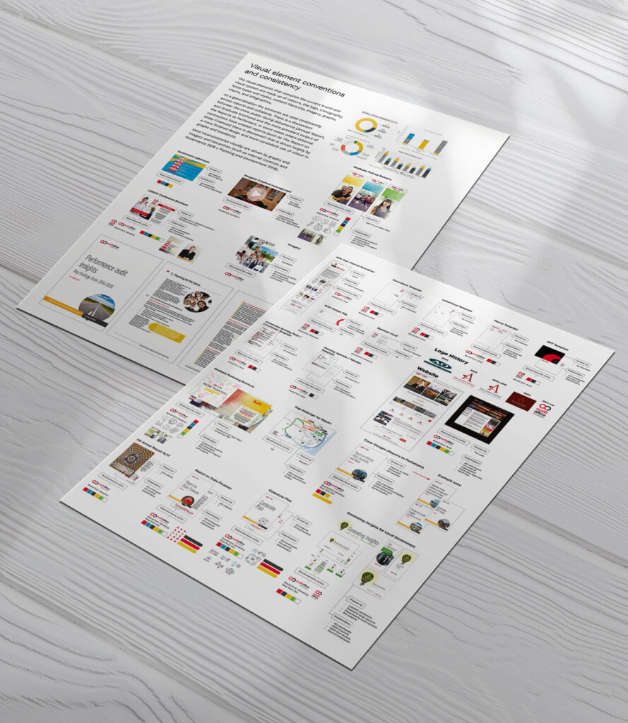
The visual elements that comprise the current brand and visual system are made up of colours, the logo, iconography, fonts types and styles, content hierarchy, imagery, graphs, charts, and infographics.
As a generalisation the elements were used consistently across reports and collateral. There was a disconnect between the more public facing documents (Annual Report, and Graduate brochure) and the more prevalent output of the Reports to Parliament. In some cases where external
contractors have created reports (such as The Report on State Finances) there is disconnect that is driven largely by a more finished design and more consistent use of colour in graphs and breakouts. Most visual inconsistencies were driven by graphs and imagery and hierarchies.
▼
Measurement
Compare current value proposition against perceived value proposition
Analyse/align internal perceptions with staff/external perceptions, providing leadership commentary
Analyse external stakeholder commentary
and perceptions
Check compliance with NSW Government guidelines
Review category consistency and align with visual elements
Determine brand promise and effectiveness through visual elements from round tables and survey results
Assess current visuals and layouts, their purpose, effectiveness and design relevance
Map visual elements for consistency across messaging
▼
Evaluation
Generate overall brand score (external/internal)
Generate brand and visual elements consistency score
Generate category score, as a comparison to other brands in market
Summarise recommendations to improve scores
Presenting our findings
In a report presented to the Auditor-General, we summarised the AO’s brand and visual systems as follows:
There is a lack of consistency in the use of brand elements
The identity scored low from an accessibility perspective
The brand is not well received within the industry
The brand is not aligned with industry expectations
Key brand visuals are verified as being low value
The visual system is difficult to work with
Having considered the audit findings, AO felt there was sufficient support, backed by data from all areas of the business, to engage a brand refresh.
In addition, an appetite for change within the institution itself fueled the desire to protect its integrity within the industry, givent the importance of the work done by AO.
Design and implementation of a refreshed brand
A brand refresh is exactly that, a refresh. While there are new assets entered into the brand’s ecosystem, generally some assets remain too. Instead, these assets are modernised or brought into line with current trends.
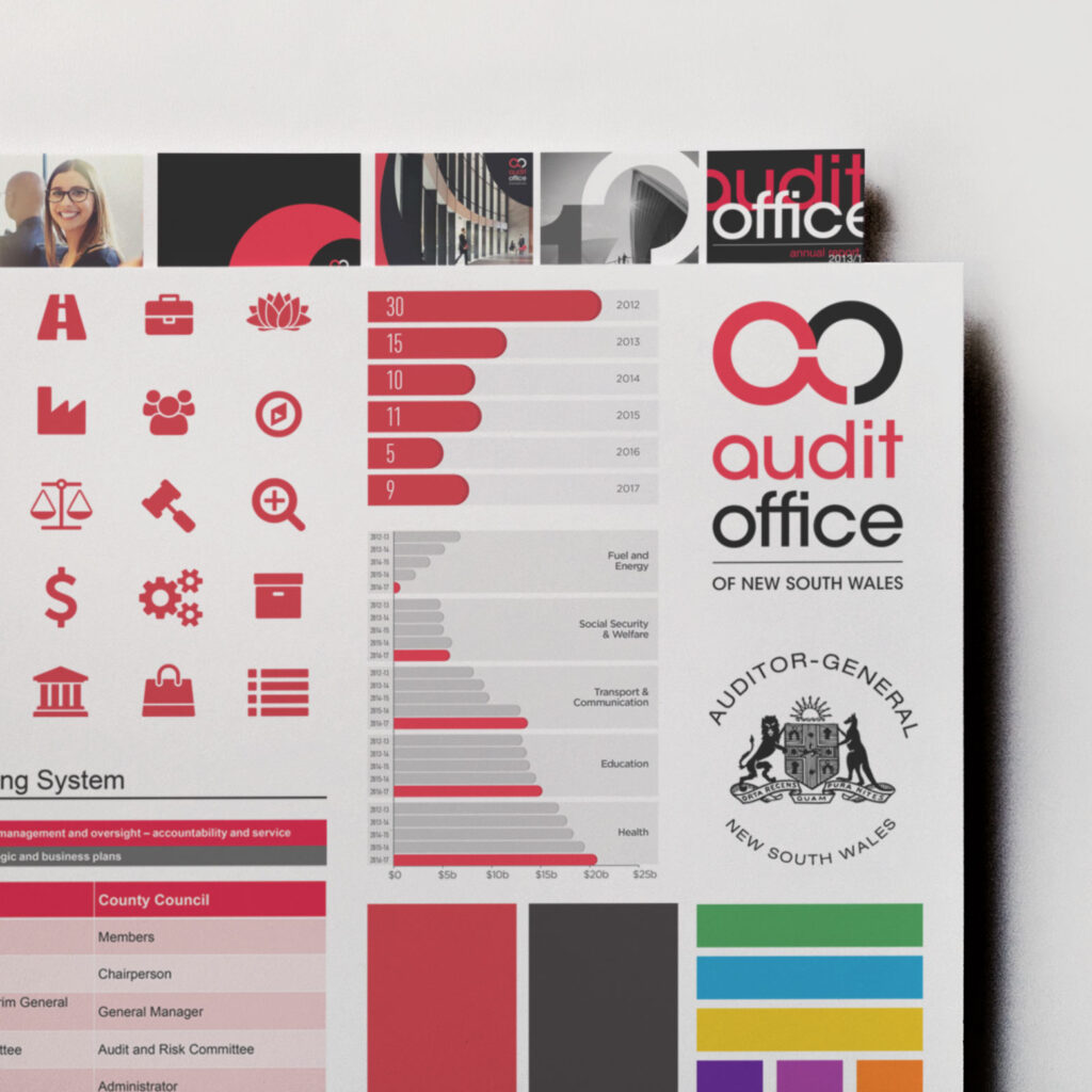
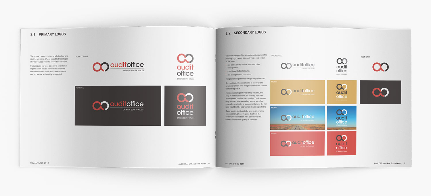
In the instance of our Audit Office refresh, we were provided direction that the logo was to remain, as well as the iconic red that had become synonymous with the Audit Office.
Logo
Then

⇽ Then
Now ⇾
Now

▼
Implementation
Refresh brand colours
Create Word, PowerPoint and report cover templates to assist in brand implementation
Creation of brand guidelines
Colour palette
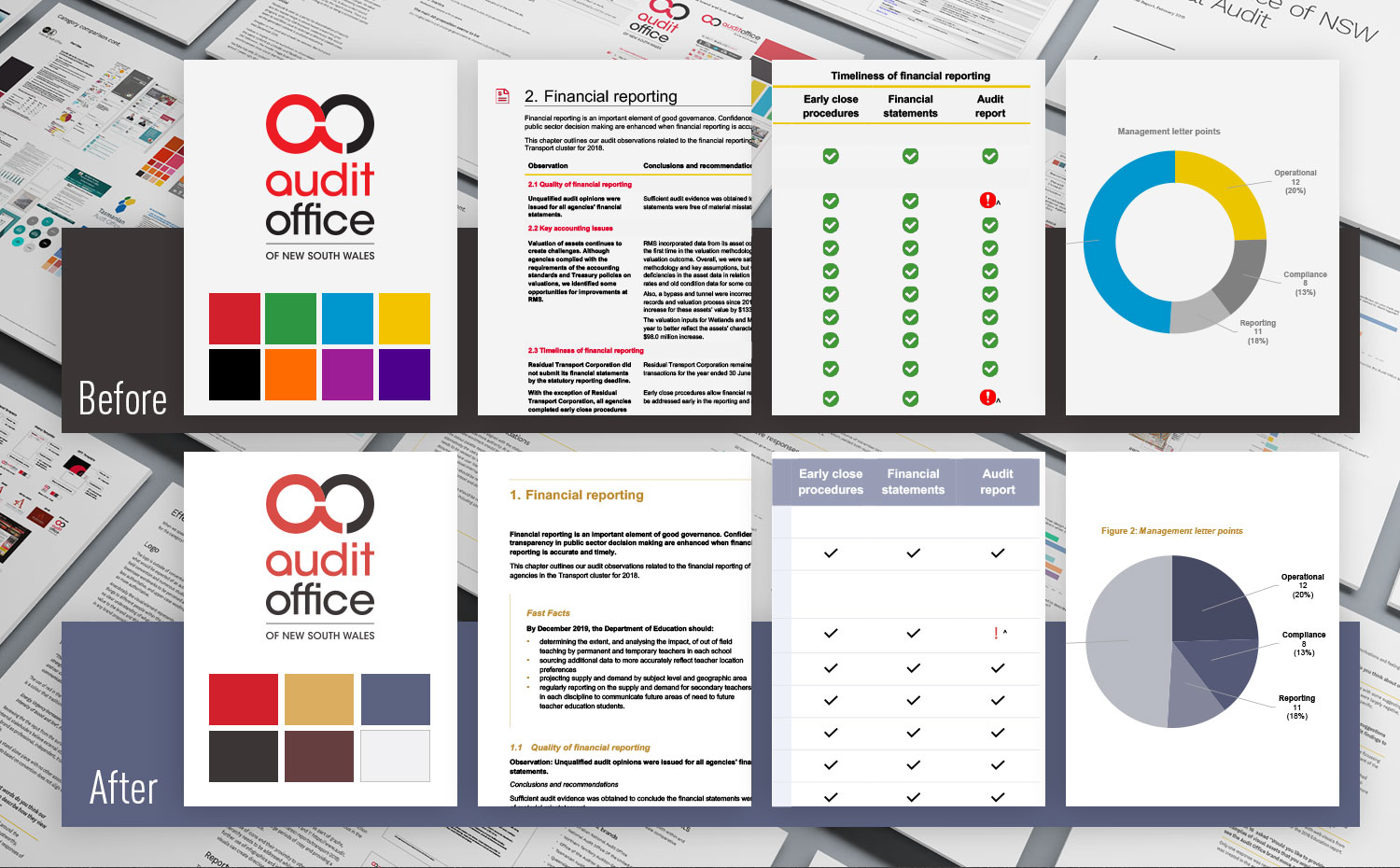
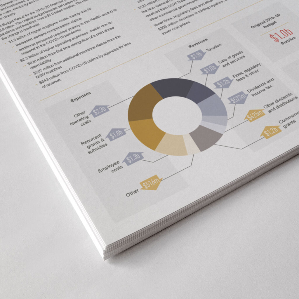
Our first focus was to modernise the colour palette. This included considering implementation holistically, across a great range of differing assets such as posters, corporate stationery, and reports to Parliament. The outcome delivered a palette that was more natural, keeping with a theme that proudly echoed the great Australian bush. With the use of shades for each colour we were able to aid accessibility and allow for the presentation of data, such as in graphs, in a cleaner, more professional manner.
We softened the colours and allowed them to work together rather than against each other.
Old palette

New palette

Accessibility
A key area of focus in the project brief involved ensuring that the visual design of the Audit Office communicated its message more accessibly, particularly for the Parliamentary reports. Comprising the vast majority of the Audit Office’s output, their reports are considered the most important publications.
Our ambition to deliver an outstanding template was made more challenging by the prerequisite that the document be built in Microsoft Word. The application has strengths as a word processor, but performs poorly in all manners that relate to layout and pagination. In addition, any template that made it to the finish line needed to be user-friendly enough for the +200 auditors who would adapt it for each individual report produced.
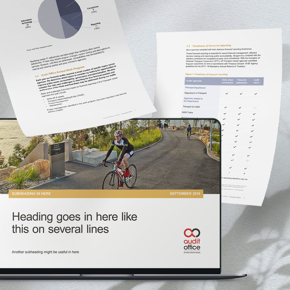
The look and feel was updated to incorporate the new colour palette, and graph and table conventions changed to represent data through shades of the colours. This ensured data was accessible, alleviating any misinterpretation of information.
Heading structure and hierarchy was reformulated, and the use of columns removed to avoid pages looking messy and unprofessional. White space around text was key in ensuring legibility and assist in reducing reader fatigue.
Brand guidelines
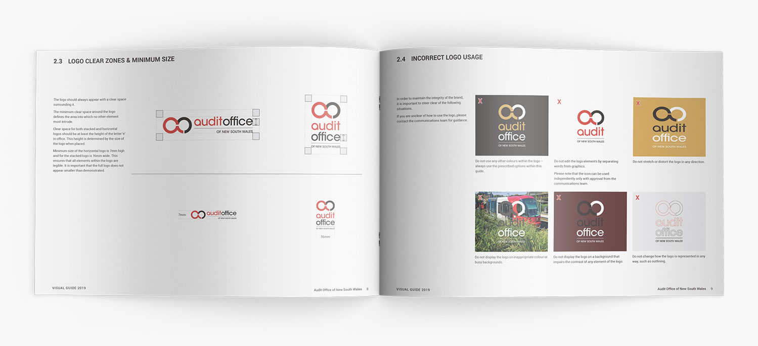
With all brand assets and elements realigned, the project was concluded with the delivery of a comprehensive set of visual guidelines – seamless direction on how to present the revitalised brand in market. Packaged together, these guidelines, font and colour files, business collateral and new Microsoft Office templates, formed a complete one-stop reference for all stakeholders of the Audit Office brand.
Outcome
We repositioned the Audit Office of NSW brand to have a more mature, organic and Australian-focused feel that represented all stakeholders.
We created all new PowerPoint templates, Word templates, and a communication suite based on the findings from the brand audit. We were careful to consider accessibility in all aspects of the rebrand, from the colour choices to template designs— using mono-coloured graphs and simple typography where possible.
We put together a visual guideline that consolidated the Audit Office’s brand, including a softer, more organic colour palette, image and text treatments, whilst keeping the signature red and logo that was close to the heart of Audit Office staff.