Navigate Financial—Brand development and strategic reinvention
Navigating the complexities of modern branding to better resonate with their audience
Project overview
PROJECT
SPECIFICS
Duration:
6 months
Year:
2022
Lead:
Client referral
Budget range:
$35-40k
SERVICES
ENGAGED
Communications
- Tone-of-voice
Content
- Copywriting
- Strategy
Creative/ strategy
- Analysis
- Art direction
- Auditing
- Concept
- Ideation
- Marketing
- Naming
- Research
- Strategy
Design
- Advertising
- Brand
- Corporate
- Web/ UI
Digital
- Analytics
- Code
- Display
- E-commerce
- EDM
- SEO
- Wireframing
- WordPress
Project management
- Estimating
- Planning
- Implementation
- Web Maintenance
PROJECT
MODULES
Logo and brand guidelines
Website planning and SEO research
Website content writing
Building website visuals and pages
Building eCommerce functionality
Finishing, deployment and testing
OUTPUT AND
DELIVERABLES
-
Brand auditComprehensive evaluation of Navigate Financial’s existing brand presence, including a thorough review of current branding elements and a competitor analysis.
-
Brand refreshNew branding for Navigate Financial, including updated logo, colours, typography, tagline, imagery and the creation of an icon set.
-
BrandmarkLogo files output in various colours, variations and file formats.
-
Brand guidelinesDetailed PDF document providing staff guidance for logo usage, typography, colour, imagery direction, and icons.
-
Content migrationTransfer of all historical orders, products, newsletter subscribers and articles from the two old websites to the new website.
-
WebsiteContent, design and build of an informational website in WordPress.
The client
ABOUT
Established in 1991, Navigate Financial Group has been a key player in Sydney’s financial advisory landscape.
This privately owned business excels in delivering bespoke financial guidance to individuals and small businesses. Known for their commitment to building lasting advice relationships, their success is anchored in a deep understanding of client needs, backed by a team of professionals affiliated with esteemed associations like the Financial Planning Association of Australia.
Background
In the wake of 2020’s COVID-19 lockdowns, we embarked on a pivotal business development drive to counteract a significant downturn in the studio’s business. This journey led us to a fruitful partnership with Navigate Financial Group, a team of skilled financial advisors operating out of Sydney’s beachside suburbs of Brighton-Le-Sands and Manly.
Challenges
The Navigate team were aware of their brand’s limitations, and seized the opportunity presented by our cold call. The impetus for revitalising their brand was clear: the post-Banking Royal Commission landscape was shifting. With a significant decline in financial advisers since the Commission’s 2018 findings—a staggering 43% drop in just five years—Navigate Financial saw an opportunity. The market was soon to be inundated with Australians seeking new financial planning services, a chance for Navigate to stand out and attract new clients.
Solution
The task at hand was not just a brand refresh; it was a strategic reinvention across various touchpoints.
Recognising the complexity and scale of the project, lcdc.co approached it through a modular framework. This approach allowed for systematic progress, clear milestones, and a cohesive outcome.
The modules were meticulously planned, starting with a brand audit, followed by a brand refresh, SEO research, content development, social media refresh, quarterly eDM newsletter, and an ongoing monthly SEO and Social campaign. Each module was a stepping stone, building towards a revitalised, robust brand presence for Navigate Financial.
Research and brand audit
Our initial step involved a thorough examination of Navigate’s existing brand assets across various mediums, including logos, brochures, websites, social media, and email communications. We meticulously reviewed 32 articles from both Brighton-Le-Sands and Manly offices, selecting 10 for detailed analysis. This process revealed inconsistencies and variants in the master brand assets, notably the Navigate logo. Often, the correct form and application of assets were infrequent, overshadowed by single-use elements like varying fonts and colours. This suggested an ad-hoc evolution of the brand identity, leading to a confused and diluted market presence. Our findings underlined the necessity of a strategic brand refresh to realign the identity and eradicate any negative perceptions.
In our review of Navigate Financial's brand, we found their tone of voice to be clear but under-represented in digital spaces.
A social media audit showed limited engagement and content distribution, indicating a missed opportunity for online presence and client interaction. The website analysis revealed user experience and technical shortcomings, highlighting the need for a digital facelift to better convey the brand’s message.
Insights gathered from stakeholder interviews at Navigate Financial were illuminating. Internal stakeholders, including staff from both the Brighton-Le-Sands and Manly offices, provided candid feedback on the brand and customer experience. They described Navigate as adaptable, personable, relaxed, and approachable, but highlighted a need to showcase their adaptability across diverse client profiles and to emphasise their long-standing, trusted, and professional nature. Visual style feedback revealed a perception of the current branding as outdated and inconsistent, with a universal call for a more cohesive, human-centred, and vibrant visual identity. These internal perspectives were critical in shaping our approach to revitalising the brand, ensuring it aligned with both employee and client expectations.
The competitor analysis for Navigate Financial underscored the effectiveness of advisor-centric content and personable branding in the financial advisory sector. Competitors leveraged structured, human-focused web designs, suggesting a clear direction for Navigate to enhance their online identity and distinguish themselves in the market.
The audit clearly highlighted the gradual, reactive evolution of Navigate’s brand identity, lacking in strategic foresight and consistency. The plethora of improvised elements had muddled the brand’s message, diminishing its perceived attention to detail, authenticity, and authority. This revelation was pivotal in validating our proposed next step: Module 2, the Brand Refresh.
Existing Logo
The audit of Navigate Financial’s logo highlighted key issues: a lack of standardisation in its presentation and overcomplication in design elements. This resulted in the logo losing prominence and clarity, and the inappropriate merging of product offerings with the master logo.
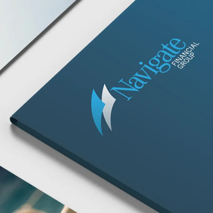
The new logo
In refreshing the logo, we focused on modernising while maintaining brand continuity. The revision emphasises ‘Navigate’ in a brighter blue, part of an expanded colour palette for added vibrancy. Adopting the serif font, Corporate A, as the wordmark, we ensured harmony with existing materials, offering a refreshed yet coherent brand identity.
Existing colours
The original colour palette of Navigate Financial was limited, primarily focused on two shades of blue from the logo, and diluted with inconsistent secondary colours. The highlights palette, while vibrant, lacked relevance to the brand, leading to a disjointed visual identity that didn’t fully embody the spirit of financial well-being.
New Colour Palette
In redefining Navigate’s colour scheme, we adopted a tri-palette approach, ensuring each palette played a distinct and harmonious role. The primary palette retained two distinct shades of blue, symbolising trust, loyalty, and security—crucial values in the financial sector. This choice aligns Navigate with well-regarded financial brands that also use blue effectively, like AMP and American Express. The secondary palette, designed to complement the primary, adds depth without overshadowing, allowing the brand to extend beyond the blue spectrum subtly. The highlights palette, with its bright, attention-grabbing hues, is used strategically for call-to-actions and key messages, providing necessary contrast and drawing focus where needed. This refreshed approach to colour not only revitalises Navigate’s visual identity but also ensures it resonates with the desired tone and message of the brand.
Existing typography
Overall, within the specimen brand samples reviewed there were ten different fonts present with two being favoured across the more recently developed articles. Corporate A, a serif font, lends a luxury brand feel, while CorpoS, a sans serif, modernises the look. The audit also highlighted a mismatch between online and offline branding due to the absence of these fonts on Navigate’s website and a need to streamline font usage, integrating Corporate A online for consistency, and replacing CorpoS due to its obscurity.

New Typography
The selection of Corporate A and Trade Gothic Next for Navigate Financial’s brand refresh expertly balances traditional and modern typographic styles. Corporate A, a serif font, brings a classic, authoritative vibe ideal for headlines, aligning with the trust and professionalism essential in finance. Trade Gothic Next, a sans-serif font, offers clarity and readability for body text, complementing the serif’s formality. This strategic pairing enhances visual hierarchy and engagement, effectively catering to the financial advice industry’s need for a blend of reliability and contemporary appeal.
Imagery findings
The brand audit for Navigate Financial revealed a need for a more authentic approach in their brand imagery, aligning with the trend of purpose-driven branding. The existing use of stylised, model-like photography was found to be less effective in connecting with the everyday audience, essential for Navigate’s outreach. This highlighted a gap between the brand’s visual presentation and its core values of authenticity and relatability.
New brand imagery
In constructing the new brand image library for Navigate Financial, our rationale was centered on authenticity and relatability. We aimed to curate photographs that resonated with the essence of real-life experiences, capturing the human element in a genuine and honest manner. This approach was driven by the understanding that images have a powerful impact on how a brand is perceived, particularly in the financial services industry where trust and relatability are paramount.
These images were not just visual elements; they were narrative tools that helped to convey Navigate’s commitment to personal, human-centered financial advice. The decision to source photographs from unsplash.com was influenced by the desire to incorporate more natural and candid shots, which aligned with Navigate’s brand values and vision.
Overall, the aim was to create a visual narrative that reinforced Navigate’s brand identity as approachable, trustworthy, and deeply connected to the human aspects of financial planning and advice.

The final brand image photography library includes 45 photographs across 7 collections:

Brand Heroes Collection
Showcasing transformative stories, this collection mirrors purpose-driven brands, highlighting real-life scenarios that resonate with Navigate Financial's values and ethos.

Of a Nautical Nature Collection
This set aligns with Navigate's location, blending beachside serenity with navigation themes, symbolic of a financial journey, akin to strategic branding approaches of leading companies.

Our Clients at Work Collection
Focused on individual client experiences, these images demonstrate Navigate's adaptability in catering to diverse financial needs, reflecting a client-centric approach in branding.

The Outcomes We Deliver Collection
Illustrating tangible success stories, this collection parallels the impact-driven narratives of industry-leading brands, showcasing the effectiveness of Navigate's financial advice.

The Family and Friends We Love Collection
Capturing moments with loved ones, these images highlight the human motivation behind financial planning, aligning with the trend towards human-centric brand narratives.

Motions of Our Trade Collection
Offering a glimpse into Navigate's operations, this collection combines professional expertise with genuine human interaction, reflecting modern service-oriented branding.

Our Community, Our Business Collection
Emphasizing Navigate's community engagement, these images showcase the firm's commitment to the areas they serve, resonating with the trend of community-focused branding.
Each description in this condensed version maintains the professional, informative, and forward-looking tone, aligning with current branding and marketing trends and emphasizing the integration of purpose and human-centric narratives in Navigate Financial's brand identity.
Brand Iconography
To elevate Navigate Financial’s branding, a focused initiative was undertaken to introduce iconography, addressing the previously noted absence of such elements. This effort resulted in the creation of 13 distinct icons, each symbolising a specific service offered by Navigate. These icons, embodying minimalistic design, are geared towards enhancing the clarity and efficiency of brand communication. This strategic addition aligns with modern branding practices, where visual simplicity and directness play a crucial role in engaging and informing audiences. The selective use of each icon, strictly paired with its corresponding service, ensures a coherent and impactful brand narrative.
Brand Book
The brand refresh of Navigate Financial culminated in a succinct yet comprehensive brand book, serving as a definitive guide for maintaining brand consistency. This essential 28-page document, presented as an A4 PDF with visual examples, delineates the guidelines for accurate brand representation across various platforms. It’s crafted to ensure the Navigate team, along with external partners, can uphold the brand’s integrity and coherence in all applications, reflecting the strategic and forward-looking approach of the brand’s evolution. This brand book is instrumental in narrating the journey of Navigate’s brand development, marking a significant step in the transition towards a modern, purpose-driven branding strategy.
Outcome
The comprehensive brand refresh of Navigate Financial, executed in collaboration with lcdc.co, stands as a quintessential example of strategic brand development in action. This initiative, a confluence of thorough brand auditing and purpose-driven branding strategies, has successfully repositioned Navigate Financial’s identity to resonate more deeply with its core values and market expectations.
Our collaboration with Navigate Financial not only chronicles a successful brand refresh but also serves as a blueprint for other businesses seeking to navigate the complexities of modern branding. It is a clear demonstration of how purposeful, well-executed branding strategies can profoundly enhance a company’s market position and resonance with its audience.